Myrsky Energia
Finnish Myrsky Energia, an all-rounder and pacesetter in the energy business and a young and rising company, needed a convincing and memorable brand. Työmaa gave the company distinctive messages and appearance that rely on natural power.
CHALLENGE
Myrsky Energia, founded in 2020, is an energy company working hard for a more sustainable future. Myrsky people are excellent professionals in the field, and the company itself is a dizzyingly growing beacon of renewable energy in Finland. Myrsky had reached a point in its growth where it had achieved first-rate results in wind and solar power, but the brand was lagging behind and the company image didn’t match the impressions that the company aroused.
Myrsky operates dozens of projects and required a distinctive voice and appearance that would convey cast iron competence and gentle cooperative culture at the same time. Työmaa took action and, together with the Myrsky people, created a brand that fits a company that’s growing towards a significant position both in Finland and all Nordic countries.
SOLUTION
The brand design was based on queries to all Myrsky people and the most important interest groups of the company, as well as joint design workshops with Myrsky. The company has emphasised the power of cooperation through its whole existence and genuinely wanted to hear its employees and other close operators, so that the quantity as well as quality and channels of communication would meet the expectations of the recipients. Throughout the cooperation, Työmaa has also acquired a great amount of information about the business and related discussion from associations, individual landowners and the media, for example.
Työmaa perceived that the traditional imagery of the renewable energy field is in severe need of debunking. Myrsky’s task is to produce domestic renewable energy to strengthen local vitality, improve Finland’s self-sufficiency and support the green transition. Työmaa consequently started to refine an idea of a continuously renewing company with the environment as one of its most important partners. Myrsky wants to keep also other collaborators close by.
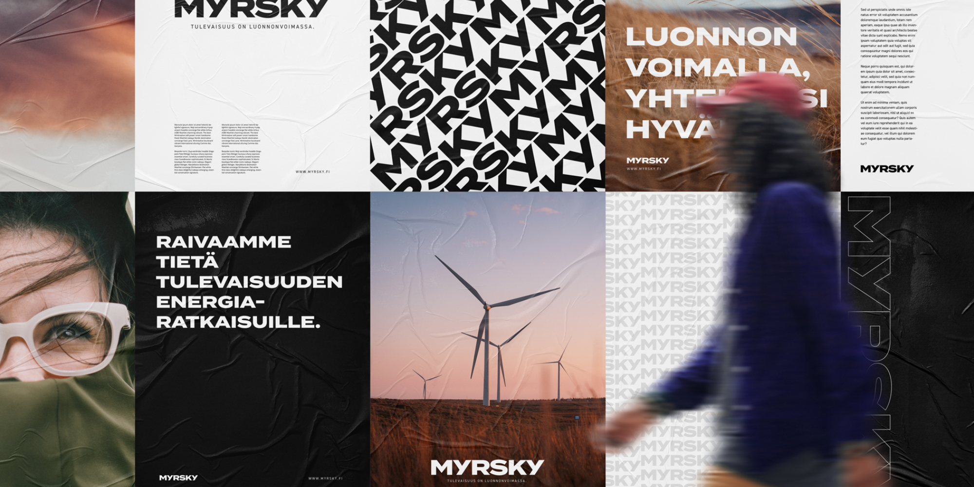
The leading idea was the image of the eye of a storm: a calm and cloudless area surrounded by fiercely howling winds and pouring rains. Myrsky speaks honestly about processes taking place in the society and its environment but doesn’t let them confuse itself or its goal. Myrsky anticipates future events wisely and wants to keep its partners near, safe in the eye of the storm. The idea finally grew into a promise that Myrsky is for the powers of nature.
Outcome
The brand was created in cooperation with the Myrsky people in design workshops that pursued bold and distinctive directions for Myrsky’s character. It was supposed to be diverse and conducive to company growth and expansion also beyond the current business lines. The goal was to create a foundation for communication that isn’t just idle clamouring: something that could support even wild future visions.
The Myrsky brand sums up facts of Myrsky as a company that’s present, clears the way and at the same time genuinely appreciates its work. The brand promise ”For the powers of nature” means that every Myrsky employee knows that the greatest power is in the nature: it can be used for creating new value every day locally, nationally and also in the Nordic countries in the future. The messages convey grit and frankness, but also plausibility and presence.
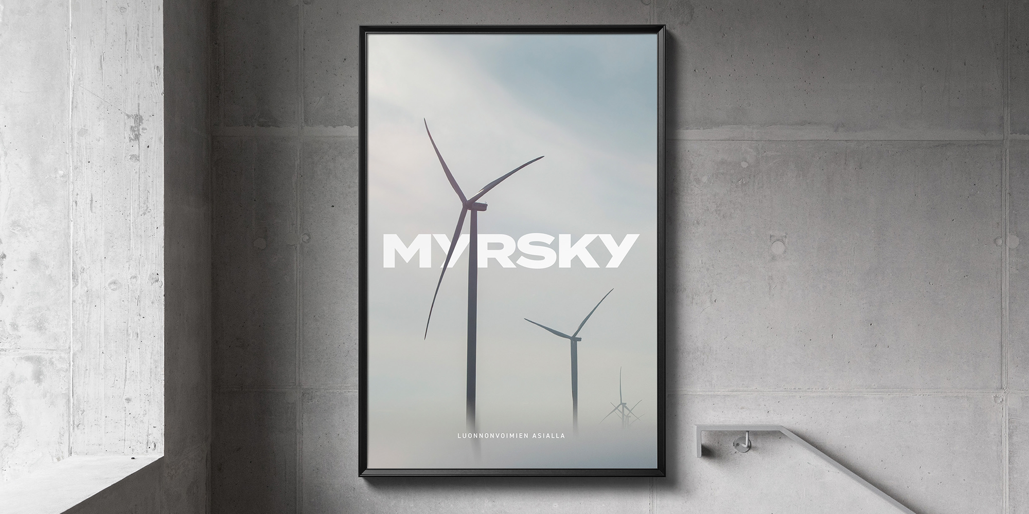
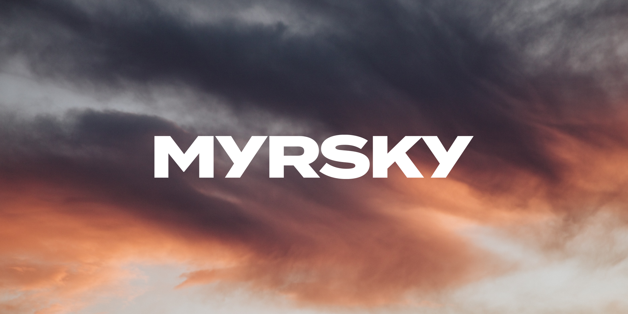
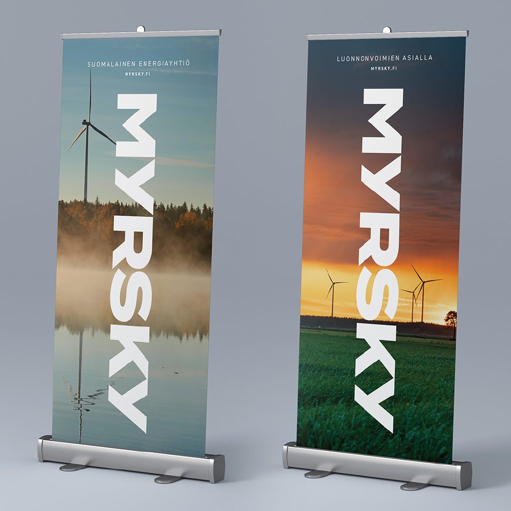
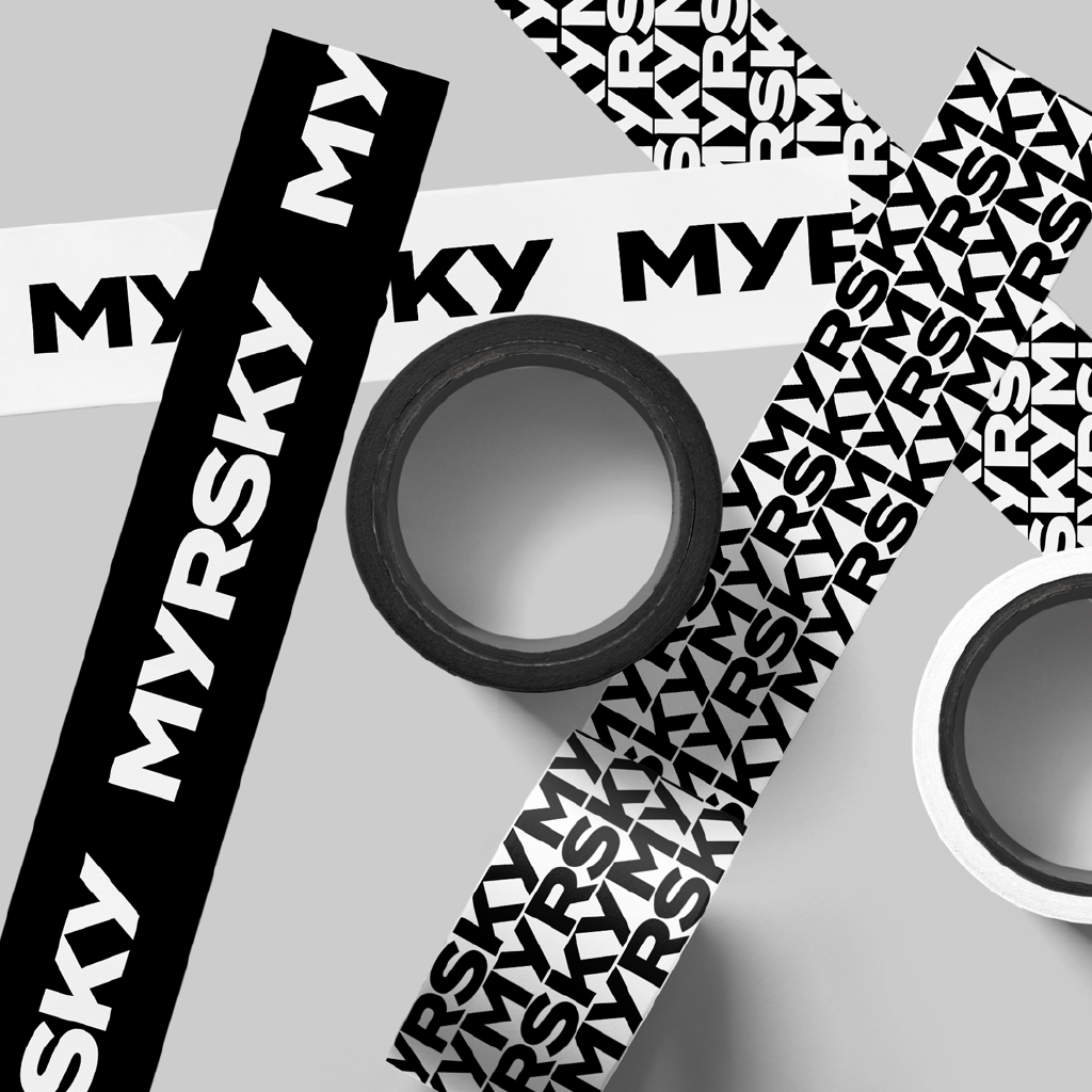
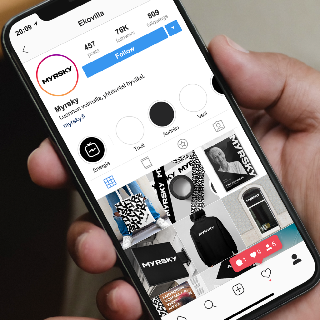
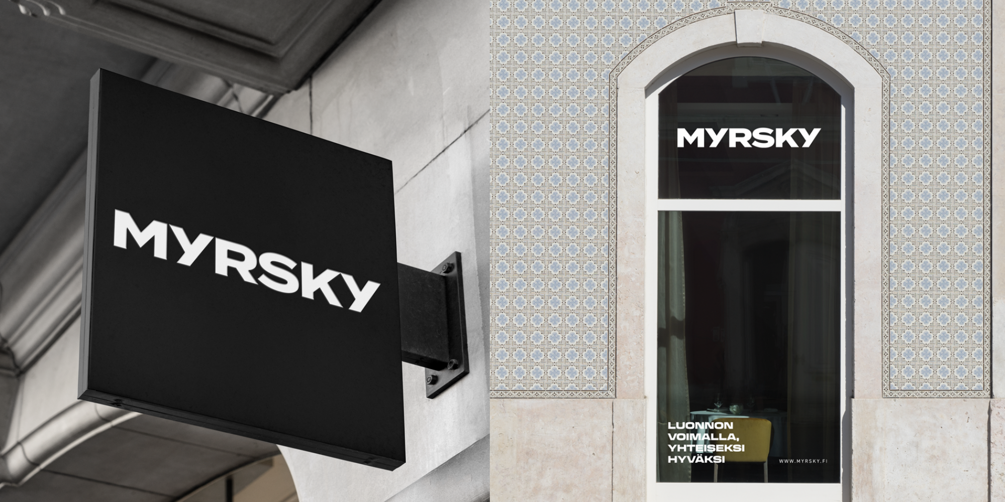
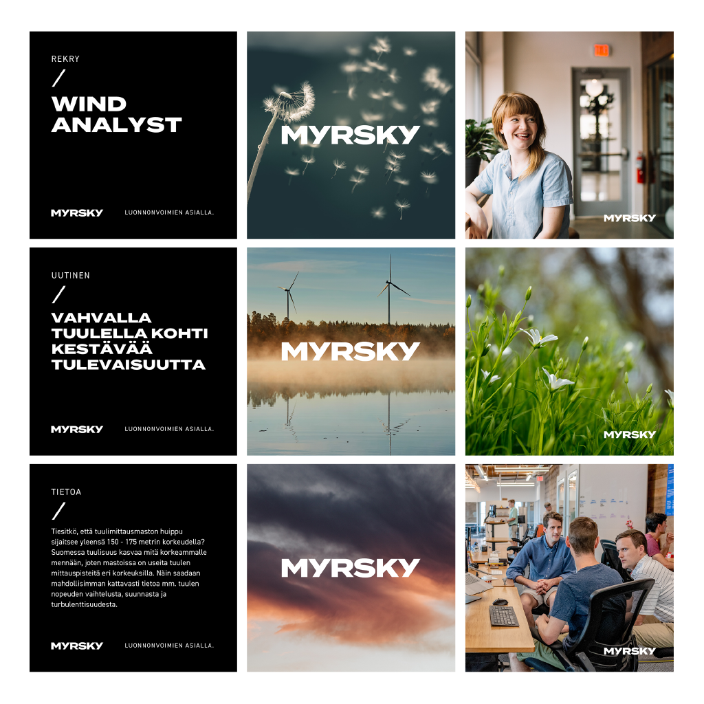
The same sincerity grows also in the visual appearance of the company. The clean and strong typeface of the logo reflects clarity and natural power. Images emphasise the charm and solidity of natural powers. The typography is concise, plausible and firm – it endures time and changes. The plainly powerful appearance underlines the sincerity of the messages.
The Myrsky brand has attracted lots of positive feedback both inside the company and outside. The close development cooperation has given a positive start to brand implementation. Work with Myrsky’s communication continues.
TYÖMAA’S RESPONSIBILITIES WERE
- Joint brand development with all Myrsky people
- Participatory query to interest groups
- Brand design
- Brand book: logo and other visual elements, brand promise and essence, tone of voice, key messages
- Visual materials of the company such as document templates, brochures, trade show materials and digital communication materials