Nordea mobile bank for iPad
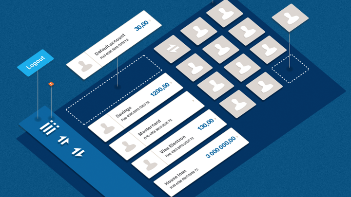
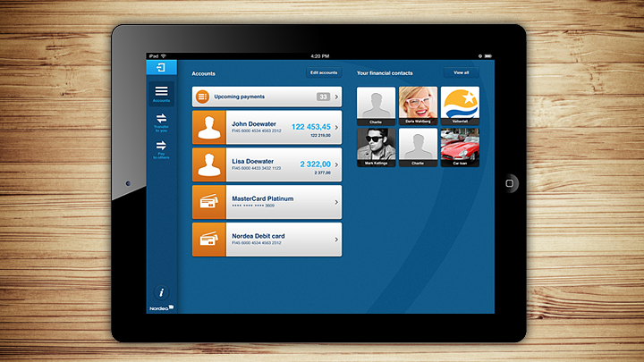
Työmaa designed Nordea's mobile bank for iPad. Työmaa's team was the Lead Designer with responsibility for the user experience and user interface design together with Nordea's cooperative partner, Tieto.
Työmaa designed Nordea’s mobile bank for iPad. Työmaa’s team was the Lead Designer with responsibility for the user experience and user interface design together with Nordea’s cooperative partner, Tieto.
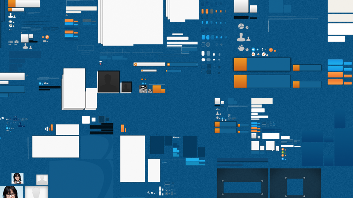
Työmaa‘s designers people used most of their time with application developers. Nordea’s business requirements also influenced the design as a counterbalance to the cooperation with programmers. Apart from UX and UI design, Työmaa produced Visual Guidelines to help the design process and created user guides for the application.
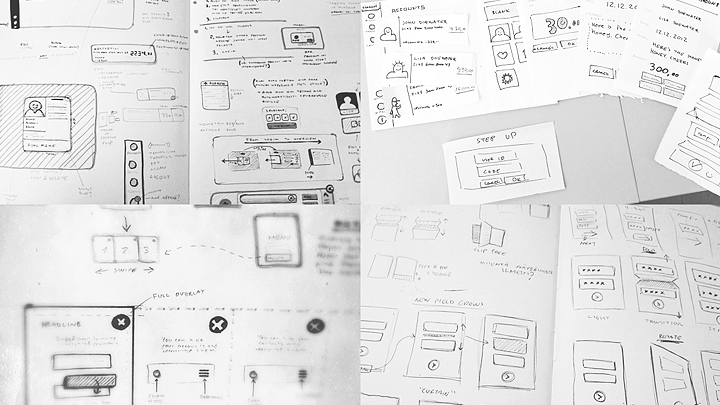
The project started from scratch and involved intensive workshops with a joint Scandinavian line-up. An iPad mobile bank was designed for Finland, Sweden and Denmark based on background research for design, drafting, wire models, concepting and paper prototypes.
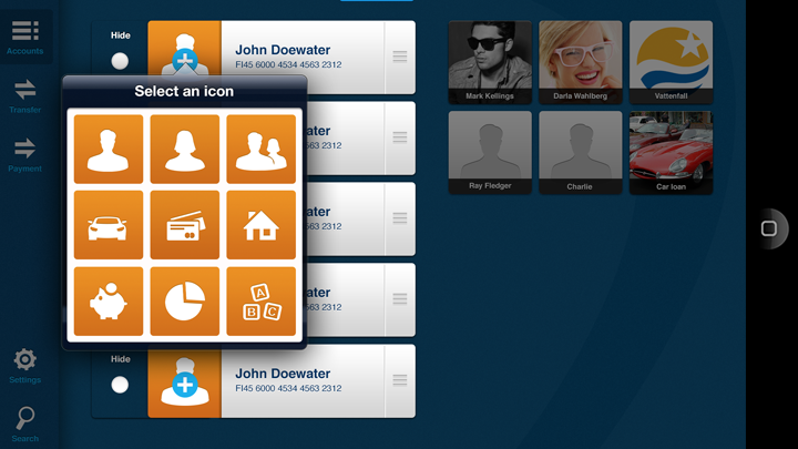
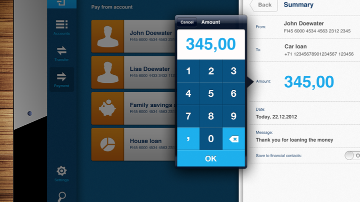
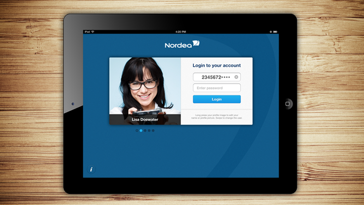
Making network payments and other transactions easier became the most important goal for the new application. Multi-user support also required the possibility to create profiles. Apart from learning paragraphs of law and banking practices, what made the project even more interesting was the wide user community from novices to heavy users, and the latter were provided with some extra functions.
Download the application from Apple App Store.
