The city of Oulu
Oulu with its 200,000+ population needed a city brand that is based on the true strengths of the region and recognised by the citizens. The brand has been created together with Oulu people, honouring good and old things, but giving the whole brand a complete facelift that serves the diverse needs of the 2026 European Capital of Culture year.
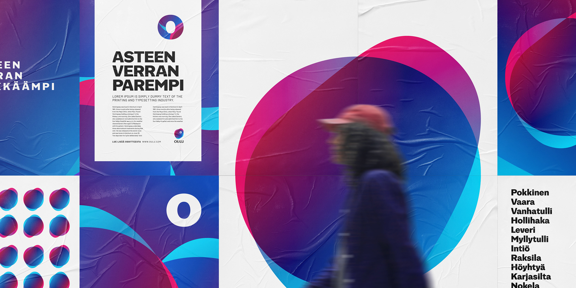
Feeling more like Oulu
Oulu city region has stretched during the last ten years. New areas, diversified culture and a teeming business sector require a city brand updated to the 2020s – one that feels natural to Oulu people.

The goal was a consistent Oulu image and messages that the citizens and companies in the region can identify with: a recognisable brand founded on the true strengths of a northern cultural city.
”We want the brand to reflect the developing, changing and diverse Oulu, and the European Capital of Culture 2026 status is a splendid example of this.”
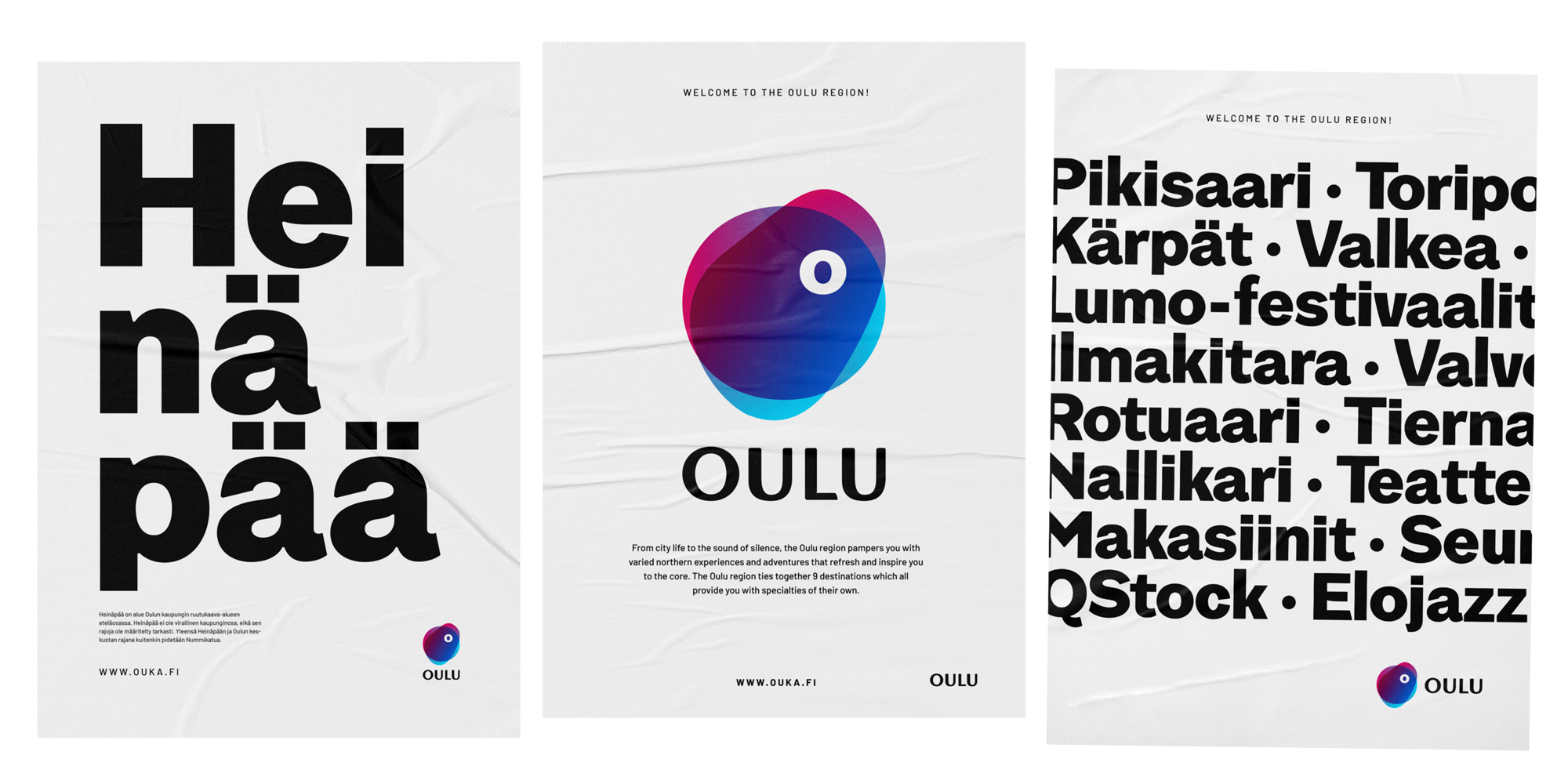
Help from 200,000 citizens
Oulu is a famous technology city and has attracted attention already for a long time. This fame made Oulu seem more monotonous than the home city that real Oulu people recognise.
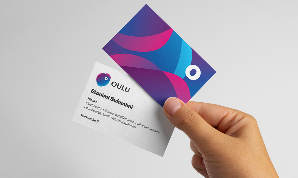
The brand relies on sincerity and had to be constructed together with Oulu people, and the planning also needed to acknowledge the internal requirements of the city organisation extensively. Working together for a common goal and a renewal achieved through genuine cooperation became the driving force in the process.
The inclusion process involved two extensive enquiries to inhabitants and encounters with Oulu people. The two-phase joint development project summarised northernness, humanity and intelligence as the three core facts of Oulu, and they were the basis for outlining a sharper idea of the brand called Oulu.
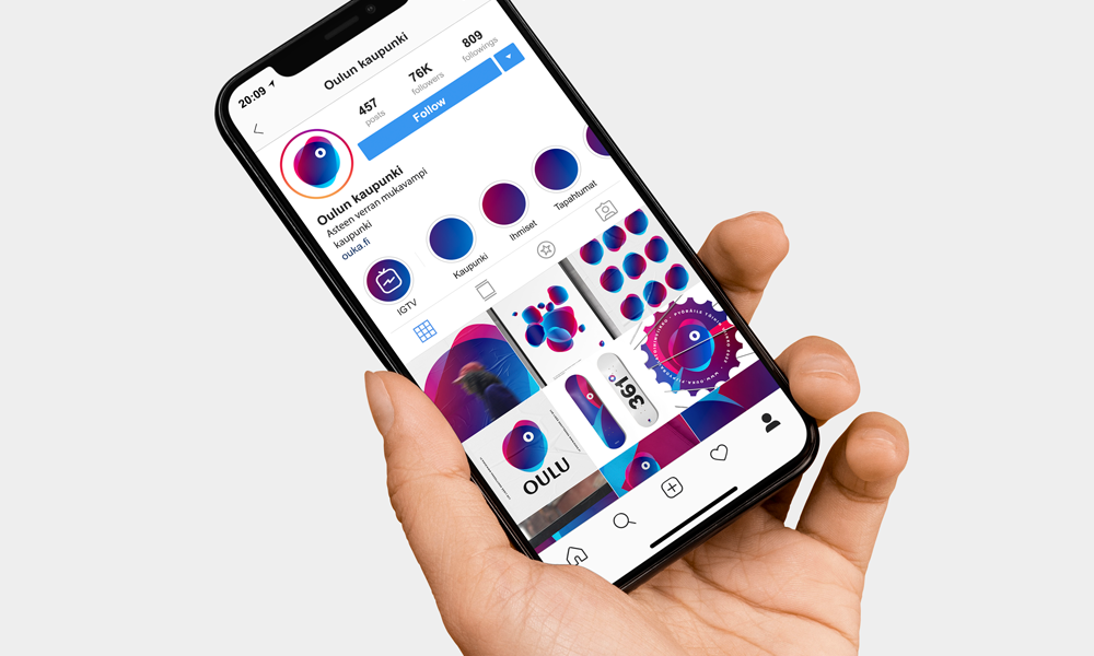
”The Oulu brand didn’t appear from thin air but from true strengths of the city and all its citizens. Oulu brand has been crafted together with Oulu people – enquiries, interviews and polls were refined into a collective understanding of the essence of the new Oulu brand.”
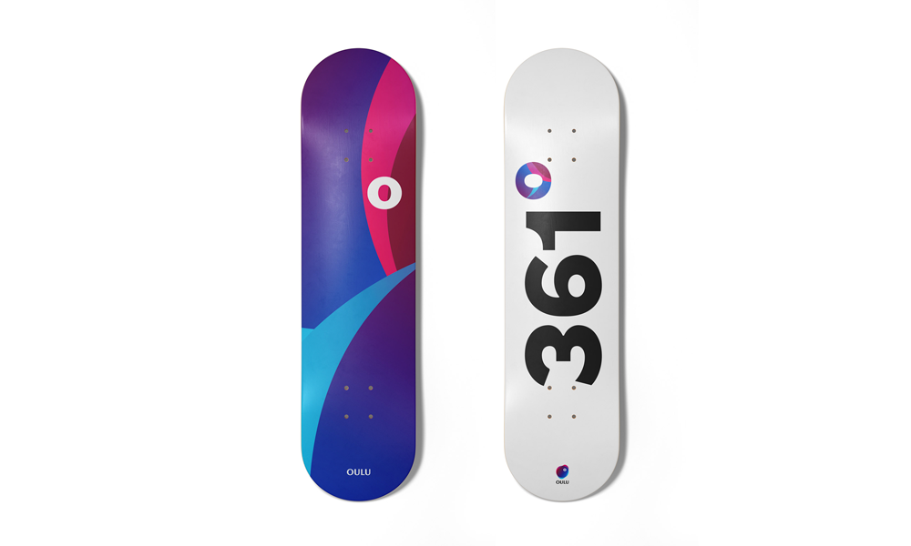

Higher grade of Oulu brand

We gave Oulu a brand identity that doesn’t rely on the past but highlights current assets that will support and truly distinguish the city also in the future. The city recognises its assets and requires no dramatic changes, so the driver behind the brand renewal was the character of Oulu.
The identity, stemming from northern nature and character, human energy, and world-class expertise, condensed into a brand promise that is intended to be a convenient and guiding tool in all actions and decisions in the city.
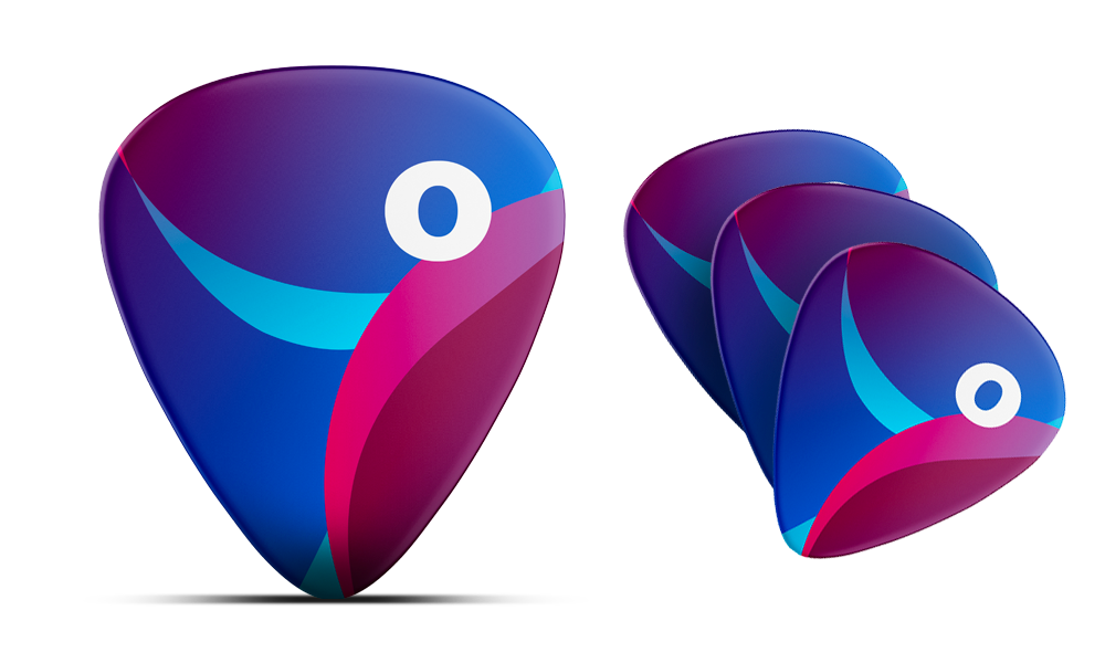
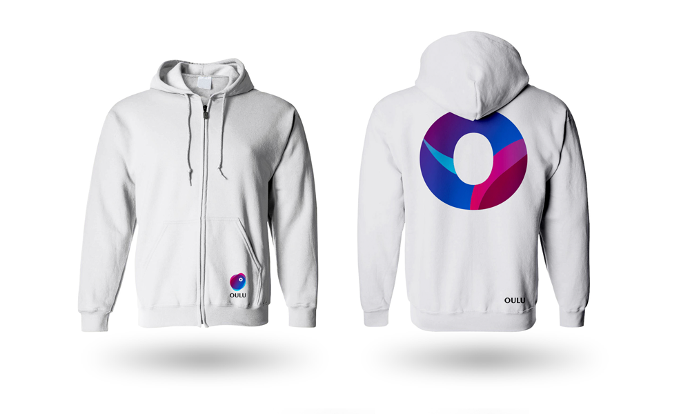
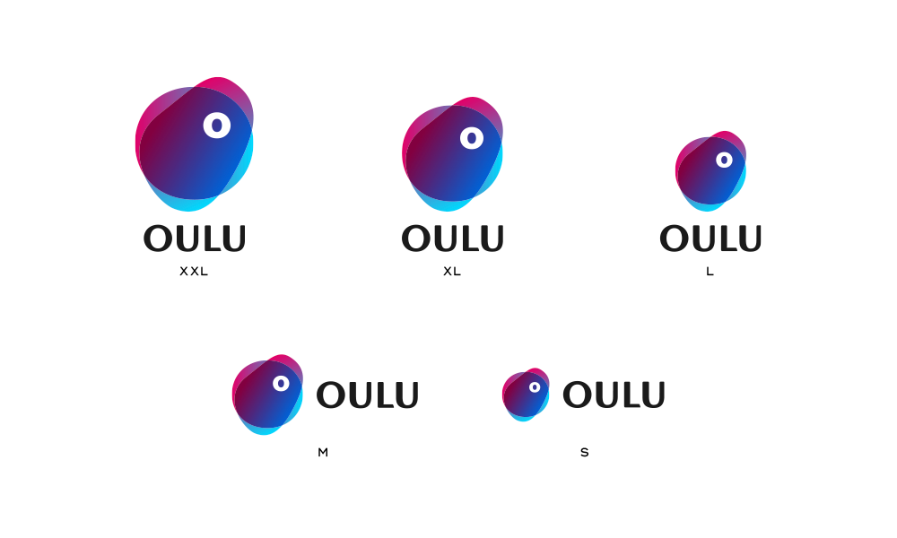
The promise comes to life in the Higher grade… mindset, which is adaptive, scalable and alive. The Higher grade… mindset is symbolised by the visual grade character, serving as the signature to the promise.
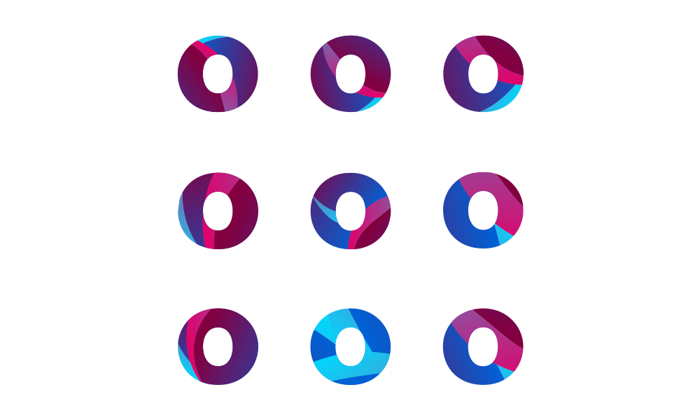
“The Grade higher… mindset of Oulu means that the promise is alive and adapts to the theme, emphasis and application.”

how it was achieved?
1. We assembled a maximally wide group of people from different fields in the Oulu city organisation and defined the starting points and purpose for the change.
2. We started a joint development project with all Oulu citizens and asked them what Oulu is like.
3. We analysed the results of the enquiry and drafted distinctive Oulu characteristics together with the steering group.
4. The hypotheses were presented to Oulu citizens in a narrative and illustrated form and submitted to critical scrutiny.
5. The core of the Oulu brand and the brand promise were formulated from the understanding acquired in the joint development project.
6. To concretise the brand mindset, a refreshed and rattled persona or look and expression was designed for Oulu.
Something new, old, pink and borrowed
The new Oulu brand identity boils down to northernness, humanity and intelligence. The brand promise, look as well as leading messages and tone of voice build up an image of a city that is a grade more Oulu.
To support the brand image, a dedicated typography, Oulun Graadi font, and an audio brand have been created for Oulu together with cooperation partners.
View the Oulu brand book here.


Työmaa’s responsibilities
- Extensive inclusion campaign for Oulu citizens and the campaign landing page
- Brand specification and analysis of inclusion process findings in workshops
- City brand: brand promise, elevator pitch, leading messages and brand tone of voice
- Visual look and image concept of the city
- Extensive brand book in its entirety
- Brand animation
- New brand launch operations: communication and social media