Arctic Blue Gin
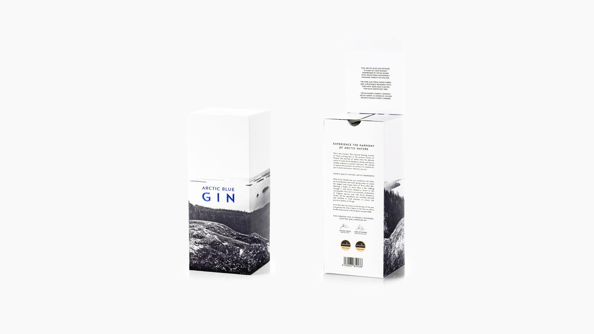
The world-famous Arctic Blue Gin from Finland trusts the creative power of Työmaa. The partnership created the look, tone of voice, creative solutions and packaging design that won gold at the IWSC International Wine & Spirit Competition in London.
Award-winning Design
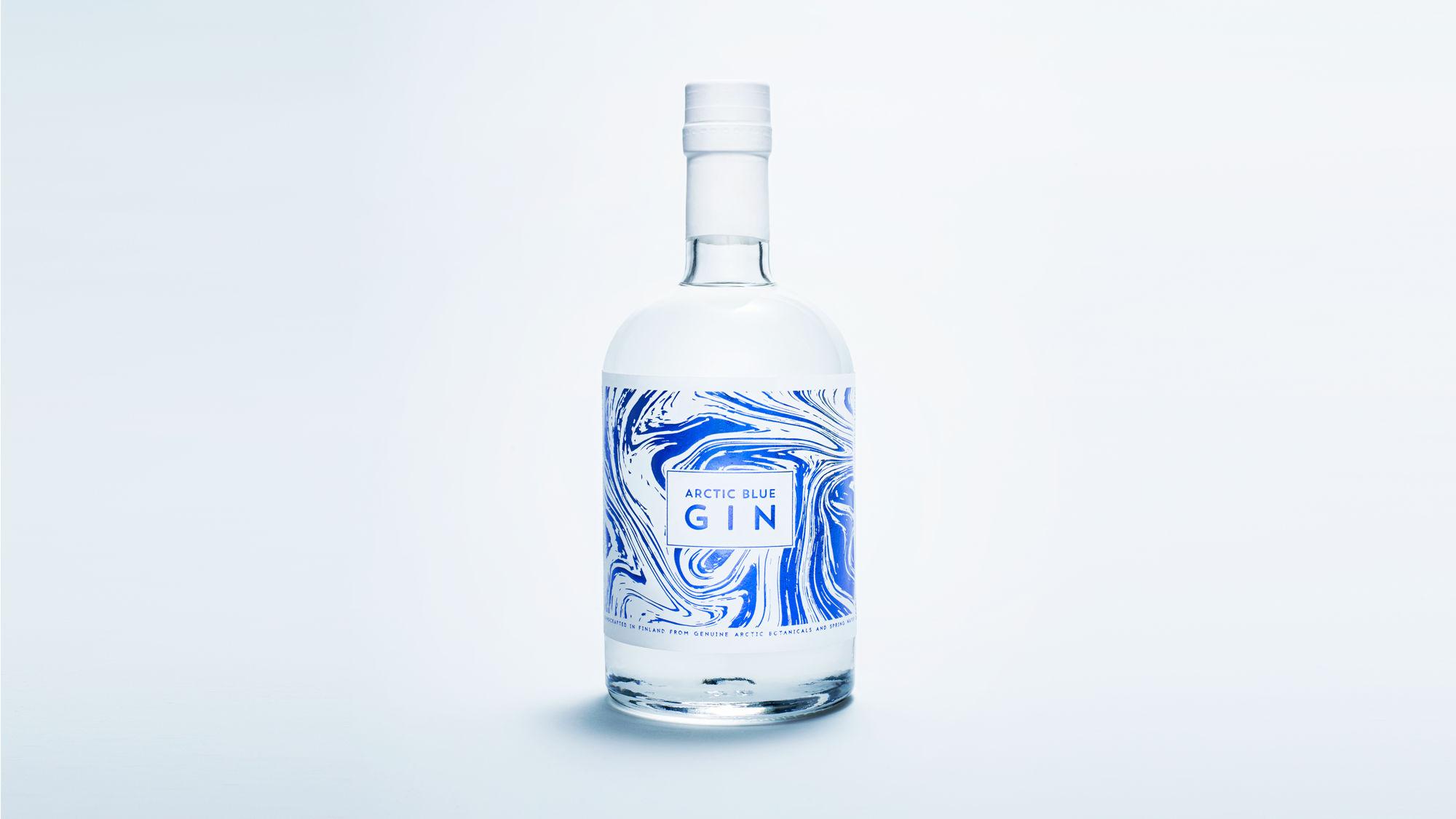
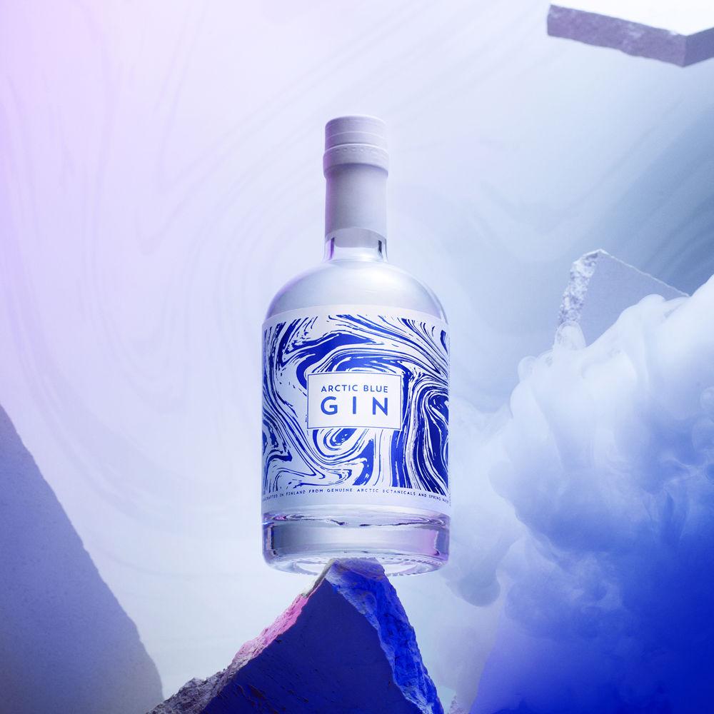
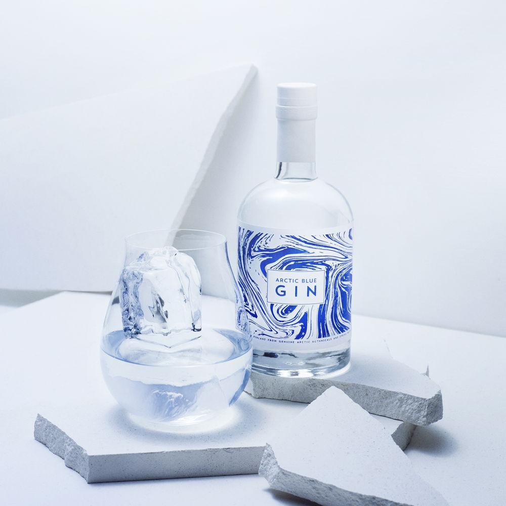
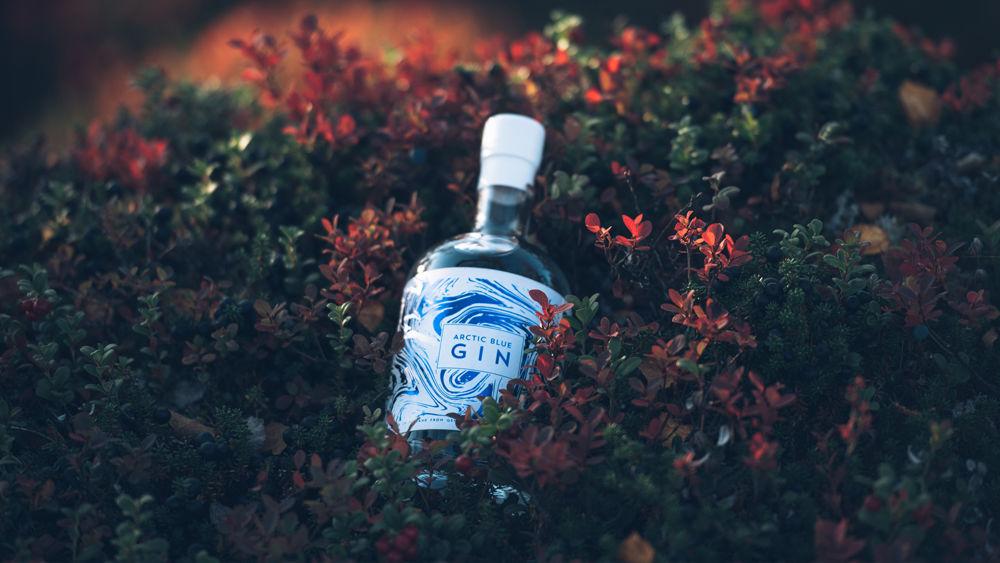
For this Arctic bilberry gin from Ilomantsi, Finland, we wanted to create a bottle so elegant and beautiful that one must have it as a decorative object. The story on the bottle label captures the intriguing soul of the product. The shape exudes the same poise as the world-recognised Finnish design classics. Therefore, on the international market, the package operates as the freshest ambassador of the Finnish flair for design.
Spirits Artwork and Bottle Design Gold Outstanding 2018
The package design of Arctic Blue Gin won gold in the International Wine & Spirit Competition 2018 in London. The packaging designed by Työmaa scored the highest possible Gold Outstanding award – which is better than “just” gold. This means that the design outstandingly gets over 93 points out of the possible hundred from the judges.
A Worthy Tone and Design for the Premium Gin
Arctic Blue Gin captures the fleeting moment of fresh morning dew in the pristine forests of Finland. Työmaa created a clean and fresh Nordic look for this premium artisan gin of gastronomy enthusiasts’ – a look that exudes the harmony of Finland’s exceptionally pure nature. The cornerstones of the brand are stylishly executed marketing materials, a genuine and thoughtfully designed tone of voice, and highest possible quality in all doing. This generated the concept ”Taste Design from Finland”.
In the international World Spirits Award 2018 competition Arctic Blue Gin won the Double-Gold award and was chosen as the Spirit of the Year 2018.
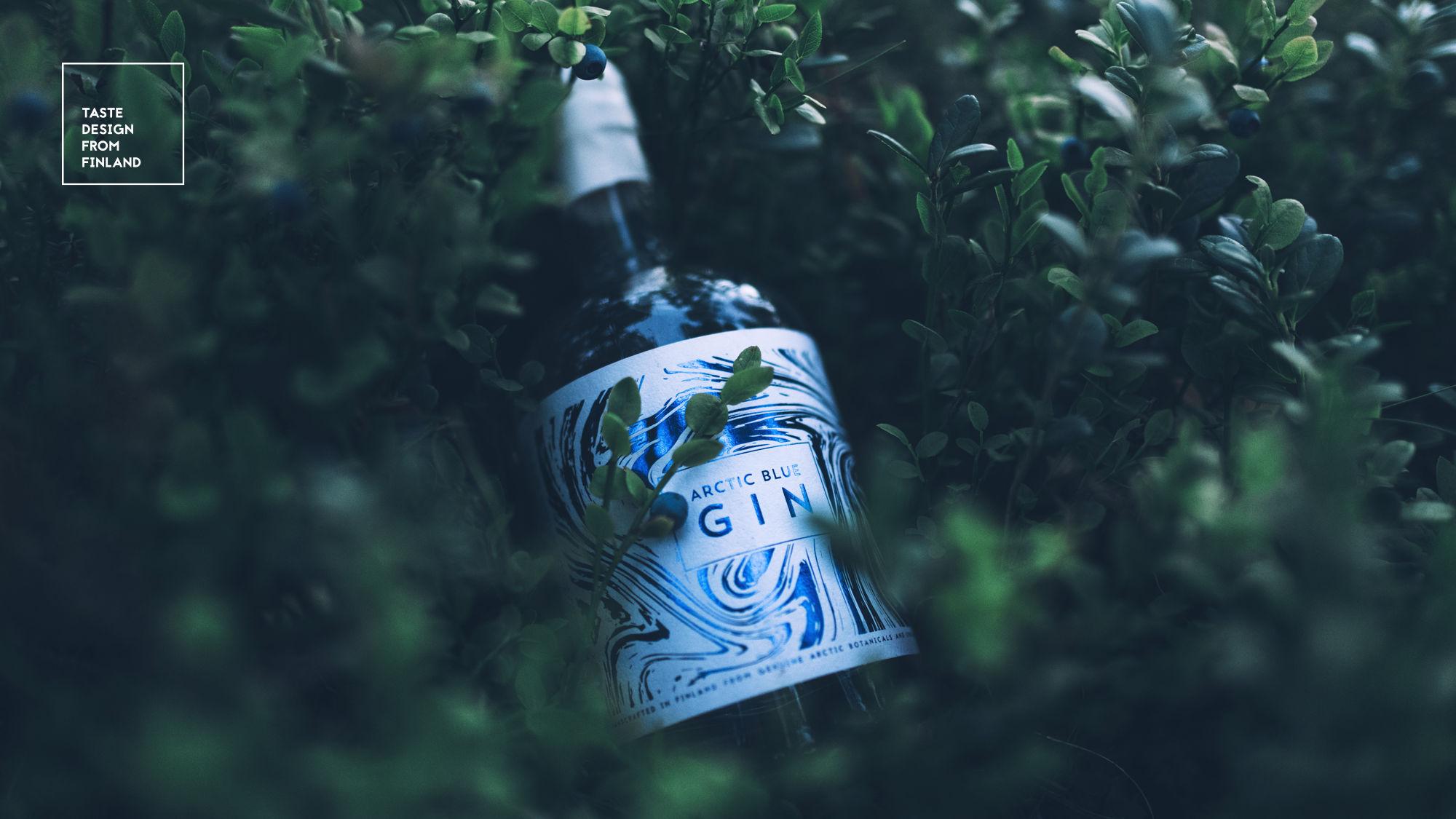
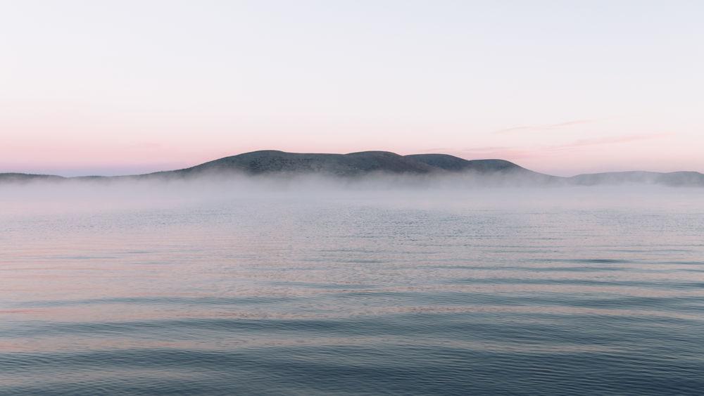
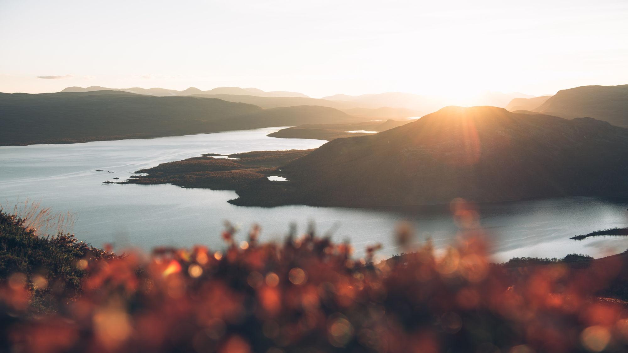
Greetings from Suomi, Ginland!
The slogan is Experience the harmony of Arctic nature – and this is what Arctic Blue Gin offers. Instagram strategy is built on breathtaking photographs taken by a designated nature photographer. With these photos anyone can travel to our unique nature and breathe the harmony from all over the world.
It’s not only about the look – it’s also about the feel
The premiumity of the brand needs to be tangible as well. The uniqueness of Arctic Blue Gin is emphasized in paper, coating and suchlike material choices. Wood and other surface textures with a natural feel – and even scent – turn Arctic Blue Gin’s POS materials into a compelling sensory experience.
It’s in our nature
Sustainable and innovative packaging material solutions build the brand image to the wanted direction. Arctic Blue Gin is a spokesperson for the unique Arctic environment; A genuinely nature-respecting forerunner brand that fights the climate change and wants to preserve the pure Arctic nature for the future generations to come.
From Työmaa to Finland and the World:
- brand image
- packaging design
- brand messages and the tone of voice (Fin / Eng)
- launching in Finland and globally
- web page design
- POS & retail
- concept and campaign design
- social media strategy and executions
- business material
- distribution and PR material
- special solutions