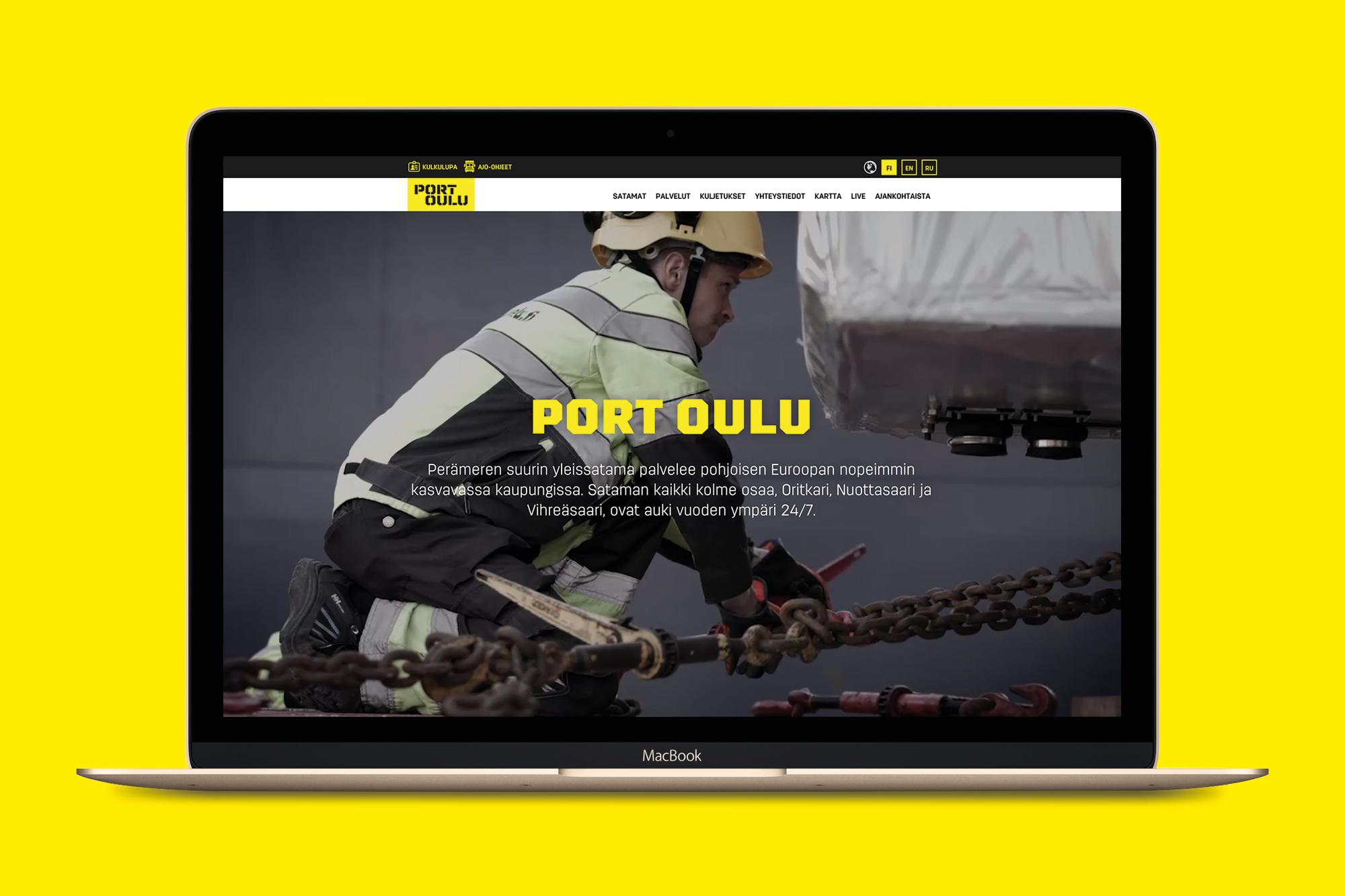
Port Oulu
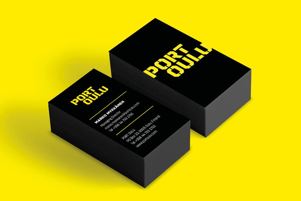
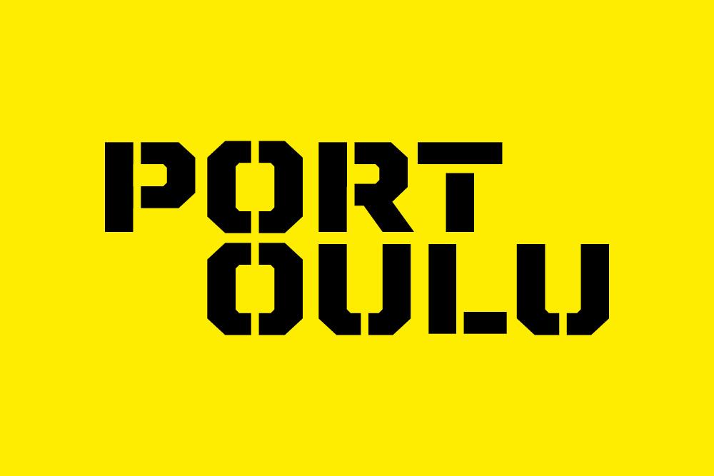
Port of Oulu went through a lot of changes with us. The visual identity of the brand, the logo and the name – all transformed in the hands of Työmaa.
#1 of the Bothnian Bay
Port of Oulu decided to show and say out loud what it is – the largest general port in the Bothnian Bay. This had to be clear from the start.
It required consistent brand building and robust implements. The port was renamed Port Oulu to replace the old Finnish name “Oulun Satama” – after all, the business is 100 % international. The logo and the look underlined the assertive message about a reliable professional of the Arctic region.
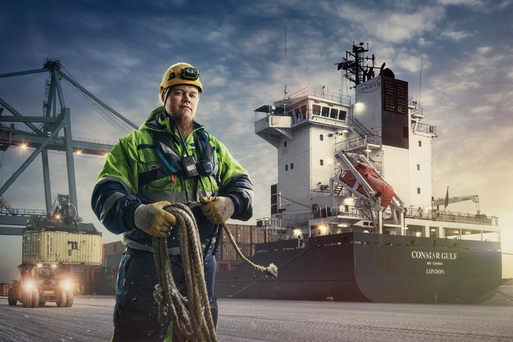
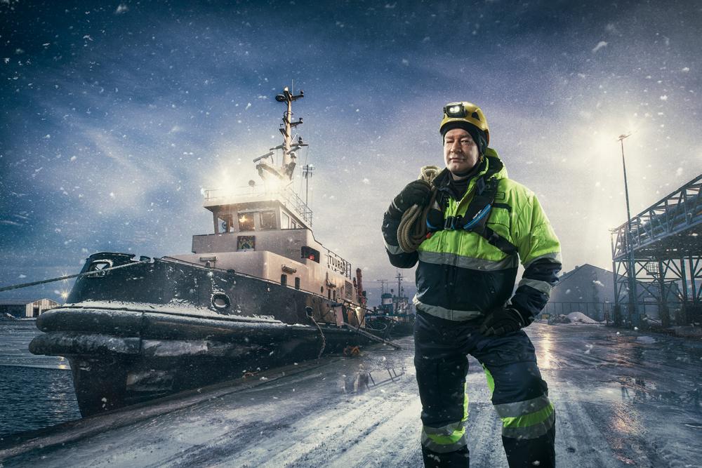
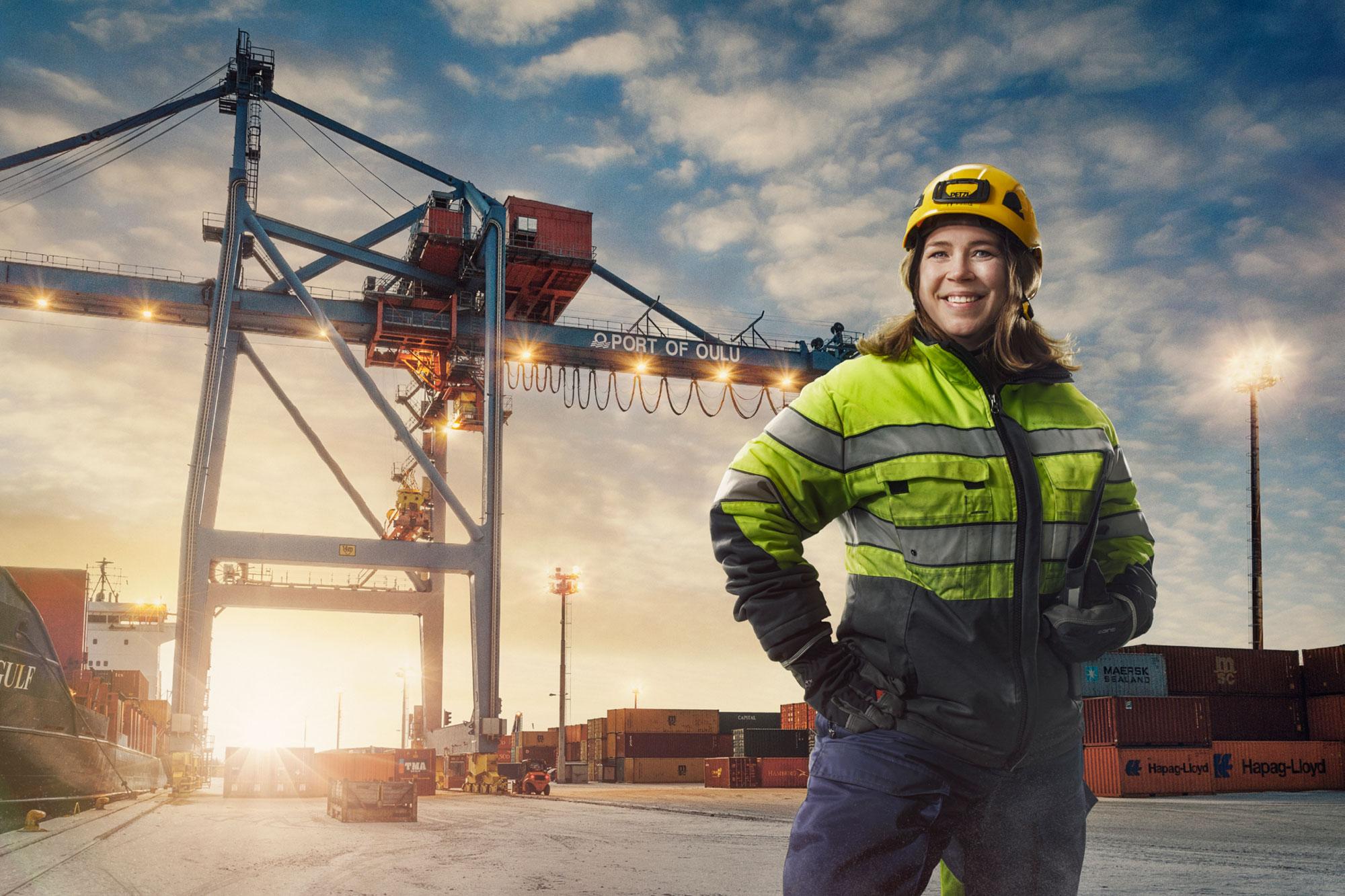
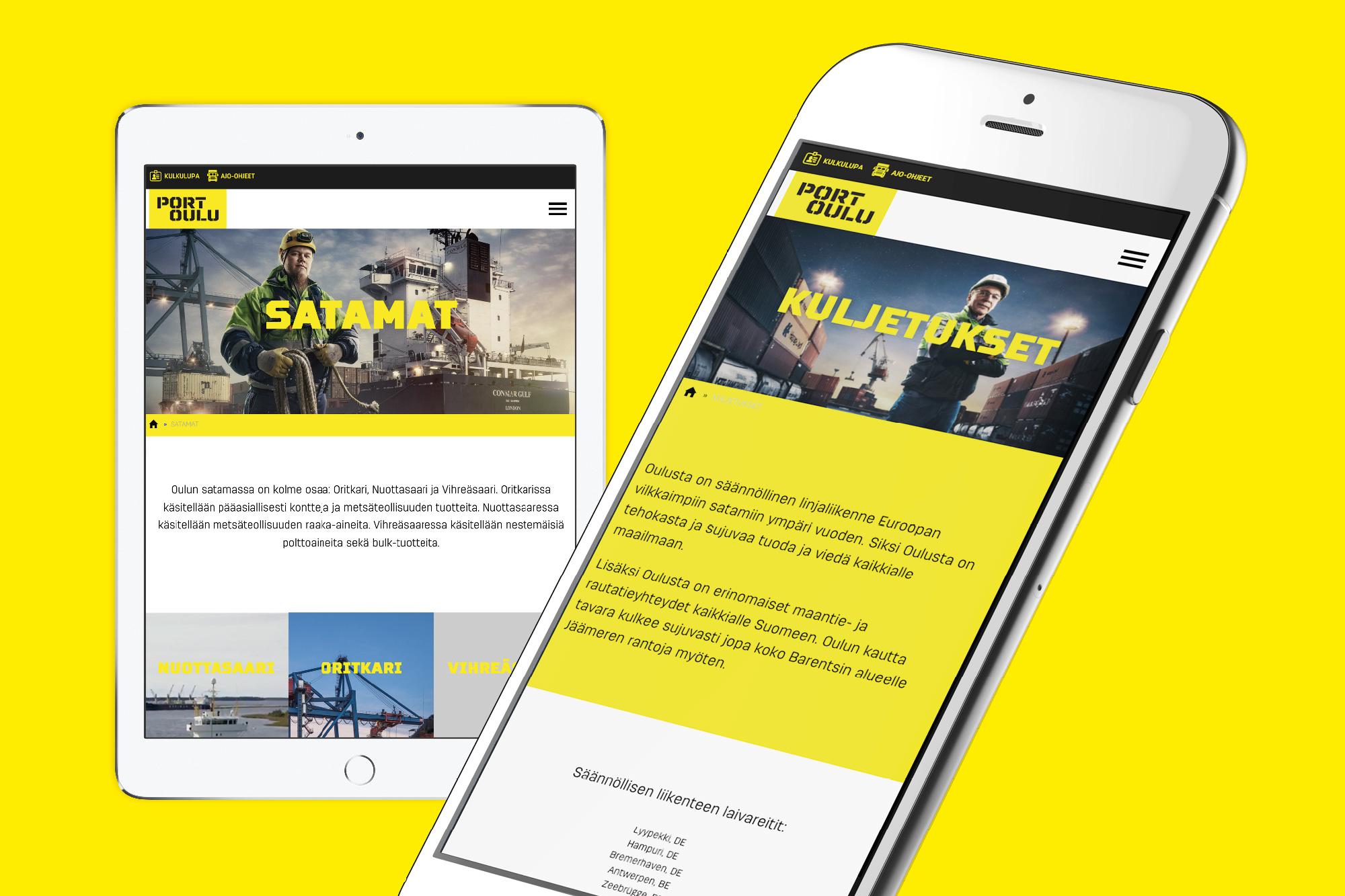
In this industry, people behind the hardware and equipments – the workers – are highly important. However, they are often ignored when ports tend to show off just their machinery. Port Oulu decided to act differently: their own staff became the core of the brand. The staff fulfills the port’s promise as a reliable professional.